


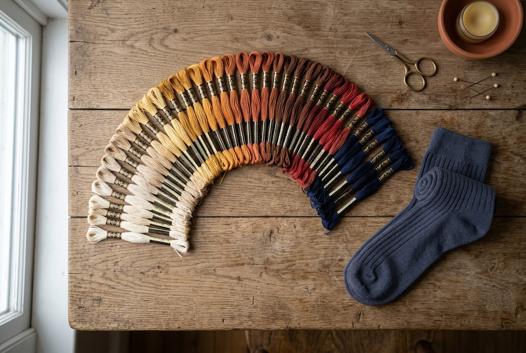
How to Choose Embroidery Thread Colour for Socks
The embroidery thread color is a thirty-second decision that decides whether anyone can read the name you spent ten minutes choosing. Get it right and the stitching looks deliberate from across a room, or quietly expensive from a foot away, depending on which you were aiming for. Get it wrong and you have paid for personalization that vanishes into the knit, or a navy dress sock with a lime green name that its owner wears once, to be polite.
This covers the one question that decides everything, thread pairings by sock color, what changes between the three ranges, and the combinations that look fine on a screen and disappointing on a foot.
Start by deciding what the stitching is for
There are only two reasons to put thread on a sock, and they pull in opposite directions.
To be read. Twelve pairs on a table at a rehearsal dinner, a team kit, a set of favors, anything where the name is the point and somebody needs to find theirs without squinting. This wants contrast.
To be noticed only up close. A monogram on a dress sock worn under a suit, seen for two seconds when someone crosses their legs. This wants restraint, and a thread only a shade or two away from the sock itself.
Most disappointing results come from choosing a thread for the first reason when the gift was really for the second, usually because the bright option looked better on the screen. Decide which of the two you are doing before you look at a single color.
Contrast does almost all the work
High contrast: light thread on a dark sock
White, ivory and pale grey on black, navy or charcoal is the combination that reads from furthest away and photographs best. It is the right answer for group gifts, for anything with a name rather than initials, and for socks that are meant to be seen on the day. The trade-off is that high contrast draws the eye to the lettering, so the spelling and spacing have to be right, and a long name will look longer than it is.
Tonal: one step away from the sock color
Charcoal thread on a black sock, mid-grey on light grey, ivory on white. The monogram is visible when you are close enough to shake hands and invisible otherwise, which makes it the right choice for business and formal wear. Nothing else looks as expensive, and nothing else photographs as badly, which is worth knowing before you order forty pairs for an event you want pictures of.
The middle ground, which usually fails
A thread two shades away from the sock, mid-grey on navy for instance, is neither read nor restrained. It looks like a mistake rather than a decision. If you find yourself hovering between contrast and tonal, take the tonal option: a monogram nobody notices is better than one that looks accidental.
Thread pairings by sock color
The exact thread options shown in the designer depend on the sock you have selected, so treat this as a shortlist to check against rather than a fixed menu.
| Sock color | To be read across a room | To be seen only up close | Skip |
|---|---|---|---|
| Black | White or ivory | Charcoal or deep grey | Mid brown |
| Navy | White or light grey | A deeper navy tone | Mid grey, black |
| Charcoal | White or a strong accent | Black or darker grey | Light brown |
| Light grey | Black or navy | White or a soft mid grey | Yellow, pale pastels |
| White or ivory | Navy, black or a strong color | Ivory or the palest grey | Anything pastel |
| Burgundy or deep tones | Ivory or cream | A darker shade of the same family | Bright competing colors |
What changes between the three ranges
The three sock types give you a different number of starting points, and that changes the approach.
- The monogram dress sock comes in six colors, all of them built for formal wear. With a short palette the tonal approach is usually right, and the sock color should be chosen to match the suit rather than the thread.
- The name-embroidered dress sock comes in twenty colors, which is the widest set to work with and the one where contrast decisions matter most. This is the range to use when a group needs to read their own names off a table.
- The ruffle-cuff cotton sock comes in nineteen colors and behaves differently again, because the ruffle itself is already a detail. Tonal thread stops the cuff becoming busy, and ivory on a soft color is the most reliable combination in the range.
All three come in one size, EU 42 to 46, so the choice between them is about the look rather than the fit. You can see the ranges side by side in the personalized socks collection, and the single-pair pricing sits in the retail range at ten dollars a pair.
Weddings, suits and matching across a group
For a wedding party, pick one thread color for everyone and vary the names, not the thread. Twelve pairs in twelve thread colors looks like twelve separate gifts that happened to arrive together. One thread color across the party is what makes a set read as a set in the photographs.
The usual failure is matching the thread to the wedding palette exactly. Thread does not color-match a bridesmaid dress or a tie, and the near-miss is more obvious than an honest contrast. Choose ivory, white or a deep tone from the same family, and let the flowers do the color matching.
Suits narrow it further: with navy and charcoal suiting, which is most of them, a white or ivory monogram on a dark sock works every time. Our notes on what color socks to wear with a suit cover the sock and trouser side of that decision, and the monogram wedding socks and luxury personalized dress socks are the two ranges most often ordered for it.
The pairings that look worse in person
Screens lie in a specific direction: they add contrast and they brighten mid-tones. Three combinations catch people out.
Yellow or gold thread on a light sock. On a screen it reads as warm and metallic. On light grey cotton in daylight it reads as a stain.
Black thread on navy. In the designer the two colors are clearly different. At arm's length in ordinary indoor light they are not, and the name disappears into the sock.
Pastel on pastel. A soft pink name on a soft cream ruffle sock looks lovely at full screen size. At cuff size it is close to blank, which is a waste of the personalization you paid for.
If the gift matters and you are unsure, order one pair first at ten dollars, look at it in daylight, then order the rest. There is no minimum at retail, so a single test pair is the cheapest insurance available.
Frequently asked questions
What is the best embroidery thread color for black socks?
White or ivory if the name needs to be read, charcoal or a deep grey if it should only be seen up close. Both are correct, they just answer different questions. Avoid mid brown and avoid anything bright on black dress socks, which is the combination most likely to end up unworn in a drawer.
Should embroidery match or contrast with the sock?
Contrast when the name has a job to do, such as a group order where people find their own pair, and match when the wearer is in formal clothes. The one option to avoid is halfway between the two, because a thread only a couple of shades from the sock looks like an error rather than a choice.
Does thread color affect how long the embroidery lasts?
Not in any meaningful way. The stitching is embroidered into the knit rather than printed on top, so it wears at the same rate whatever color it is. What changes with color is how visible ordinary wear becomes: pale thread on a dark sock shows lint and marks sooner than tonal thread does.
What thread color works for a corporate order?
Tonal, almost always. Initials in a thread close to the sock color suit clients and colleagues, because the gift does not announce itself in a meeting. If the socks are being worn at an event where the branding is the point, switch to high contrast and accept that they will be worn less often afterwards.
Can I use a different thread color for each person in a group?
You can, and for most group orders you should not. A single thread color across the whole group is what makes twelve pairs look like one gift rather than twelve. Vary the names, keep the thread constant, and let the sock color do any differentiating you need between the two sides of a wedding party.
How do I know what the thread will really look like?
View the preview in daylight rather than at night, and remember that a screen exaggerates contrast. For a single gift, trust the shortlist above. For anything over ten pairs, order one pair first, look at it on an actual foot, and then place the full order with the decision made.
Applying it
Decide whether the stitching is meant to be read or only noticed, then pick from the table above. Our guide to what to write on personalized socks covers the wording and monogram etiquette covers the letter order. The name-embroidered dress socks and ruffle socks with custom text are where the choice gets made.


